+55 11 96894.4656
contato@stehantonoff.com
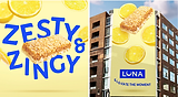
Luna
LUNA had been a trusted name in better-for-you snacking for years, but the shelf had changed around it. As competitors embraced more vibrant, taste-forward identities, the brand's packaging began to feel out of step with the experience it offered. The challenge was to modernize the brand without losing the trust and recognition it had built over time.
Inspired by LUNA's lunar heritage, the new identity brought a greater sense of lightness, optimism, and joy to the brand. Through brighter colors, refined typography, and playful floating ingredients, the packaging shifted from functional and nutritional to something more expressive, approachable, and craveable.
Agency: Design bridge and partners
Creative Director: Scott Lambert | ryan boyd
Design Director: Jorge Galán


The project showed how much perception can influence relevance. By shifting the focus from functional nutrition to a more joyful and taste-driven experience, LUNA was able to reconnect with consumers in a category that had evolved significantly since the brand first launched. The refreshed system helped the brand feel contemporary again while preserving the trust it had built over decades.